-
-
Save FredrikOseberg/87795296efb67fe76fa05fc839d22e25 to your computer and use it in GitHub Desktop.
| import React from "react"; | |
| import { createChatBotMessage } from "react-chatbot-kit"; | |
| import SingleFlight from './components/SingleFlight/SingleFlight' | |
| const botName = "Somebot"; | |
| const config = { | |
| // Defines the chatbot name | |
| botName: botName, | |
| // Defines an array of initial messages that will be displayed on first render | |
| initialMessages: [ | |
| createChatBotMessage(`Hi I'm ${botName}`), | |
| createChatBotMessage( | |
| "First things first, which airport are you looking for information from?", | |
| { | |
| widget: "airportSelector", | |
| delay: 500, | |
| } | |
| ), | |
| ], | |
| // Defines an object that will be injected into the chatbot state, you can use this state in widgets for example | |
| state: { | |
| airports: [], | |
| flightType: "", | |
| selectedFlightId: "", | |
| selectedFlight: null, | |
| }, | |
| // Defines an object of custom components that will replace the stock chatbot components. | |
| customComponents: { | |
| // Replaces the default header | |
| header: () => <div style={{ backgroundColor: 'red', padding: "5px", borderRadius: "3px" }}>This is the header</div> | |
| // Replaces the default bot avatar | |
| botAvatar: (props) => <FlightBotAvatar {...props} />, | |
| // Replaces the default bot chat message container | |
| botChatMessage: (props) => <CustomChatMessage {...props} />, | |
| // Replaces the default user icon | |
| userAvatar: (props) => <MyUserAvatar {...props} />, | |
| // Replaces the default user chat message | |
| userChatMessage: (props) => <MyUserChatMessage {...props} /> | |
| }, | |
| // Defines an object of custom styles if you want to override styles | |
| customStyles: { | |
| // Overrides the chatbot message styles | |
| botMessageBox: { | |
| backgroundColor: "#376B7E", | |
| }, | |
| // Overrides the chat button styles | |
| chatButton: { | |
| backgroundColor: "#5ccc9d", | |
| }, | |
| } | |
| // Defines an array of widgets that you want to render with a chatbot message | |
| widgets: [ | |
| { | |
| // defines the name you will use to reference to this widget in "createChatBotMessage". | |
| widgetName: "singleFlight", | |
| // Function that will be called internally to resolve the widget | |
| widgetFunc: (props) => <SingleFlight {...props} />, | |
| // Any props you want the widget to receive on render | |
| props: {}, | |
| // Any piece of state defined in the state object that you want to pass down to this widget | |
| mapStateToProps: [ | |
| "selectedFlightId", | |
| "selectedFlight", | |
| ], | |
| }, | |
| ], | |
| }; | |
| export default config; |
Hello, thank you for the work.
My question is How can I plz use the header of the customComponents in another component in my app.
I want to use it for a component unmount (So when i click on the header the chatbot is reduced ) .
Thanks.
Have you find any solution??
Have you find any solution?
Hi, Does this libraray works with React-Native @FredrikOseberg ?
using functional approach for the actionProvider and messageParser... wheni console.log props in the component that it to be rendered and defined in widgetFunc the props.actionProvider is empty ...thought if i swtich back to class components then it props.actionProvider has all functions defined in actionProvider
and why createClientMessage is not a function in functional component?
@FredrikOseberg, i am using your chat bot i have modified chat header here i want load widget when i click icon which i marked in blue color in screenshot
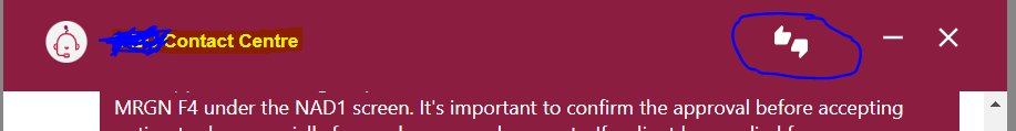
And chat code is
{showBot ?
<Chatbot
config={config}
actionProvider={ActionProvider}
messageParser={MessageParser}
disableScrollToBottom="false"
headerText={
<div style={{ display: "flex" }}>
<div style={{ display: "flex", alignItems: "center" }}>
<img width="50px" height="30px" src=' alt='' />
<div style={{ display: "flex", alignItems: "center" }}>
<ThumbsUpDownIcon style={{ cursor: "pointer", color: "white" }} />
<RemoveIcon style={{ cursor: "pointer", color: "white" }} onClick={() => minimizeBot()} />
<CloseIcon style={{ cursor: "pointer", color: 'white' }} onClick={() => toggleBot('false')} />
}
/> :
<IconButton className="chatbot-icon" style={{ cursor: "pointer", color: "white" }} onClick={() => toggleBot('true')}>
{/* */}
}
Can you please help this
@FredrikOseberg Hello, thank you very much for this package. I have a question, I can't break lines within the bot's messages. <br / > and \n don't work. Can you tell me what I should do?
Hey @FredrikOseberg,
I am trying to add Arabic support to the chatbot. For that, I want to display chatbot messages on the right and user messages on the left. Could you please share if this part is dynamic? Can we access to show messages vice-versa?
@FredrikOseberg Is there way to change the send Message icon ?